For our first project at Metis, we explored using publicly available MTA turnstile data to identify trends in foot traffic and determine where one would optimally deploy street teams to maximize the number of contacts collected.
The two most important questions to answer when starting on any data science project are:
- What is the question you want to answer (and the business case for this question)?
- What data do you plan on using and how will you obtain it?
Thankfully, the project parameters addressed both of those questions - but I imagine that a lot of time will be spent here when embarking on more open-ended projects in the future!
Project Scoping
We first divided the problem space into two distinct areas for exploration:
- Volume - Maximizing exposure to subway commuters
- Conversion - Optimizing the likelihood of collecting signatures from desirable gala attendees and donors
We decided to focus exclusively on volume, but given more time would have incorporated additional datasets to address conversion.
Tools
It’s worth describing some of the fundamental tools to perform data analysis and visualization using Python (to be expanded on in an upcoming post - Essential Python Libraries for Data Science). While many are likely familiar with these libraries, I will describe my impressions of them here as I intend to reference them frequently in future posts.
- Data Analysis
- NumPy - NumPy is a linear algebra library for Python. NumPy can be used to perform linear algebra (matrix) operations and many useful math operations.
- Pandas - Pandas is an open source library built on top of NumPy. It is primarily used for data cleaning and preparation, allows fast analysis, and can work with data from a wide variety of sources. The core of Pandas is the Dataframe, an object similar to an Excel table that allows one to filter, subset and perform operations on data.
- Data Visualization
- Matplotlib - Matplotlib is the most popular plotting library for Python. It gives enormous control over every aspect of a plot but is dexterous enough to produce a quick visualization with just a few lines of code.
- Seaborn - Seaborn is the aesthetically pleasing cousin to Matplotlib - it is built off Matplotlib and is designed to work well with Pandas.
Approach
- Acquiring Data - Weekly subway turnstile data since May 2010 is available on the MTA’s website. Acquiring the data was a simple matter of pulling several week’s worth of data from the site. We decided to use May 2016 data to approximate traffic during the anticipated deployment time period of May 2017.
- Understanding the Data - Turnstile counts were tracked as cumulative entries and exits, for several measures of time during the day, for an individual turnstile. To see patterns in the data by station, it became apparent that we would have to aggregate the data across individual time intervals for each station. To make things a little more complicated, the time measures were not uniform and there were occasions where turnstile counts were reset or irregularly audited.
- Cleaning and Prepping the Data - This was primarily executed using Pandas and included:
- Removing trailing whitespace
- Parsing date time values
- Calculating incremental entries/exits
- Removing outliers
- Exploring the Data - To investigate our project objectives, we performed the following aggregations to understand which stations had the highest volume and how turnstile traffic varied by time:
- Time of day
- Day of week
- Station
- Creating Meaningful Visualizations - We wanted to share our findings with others, and as the old adage goes, a picture speaks a thousand words. Each graph we plotted illustrated a key point.
Findings
-
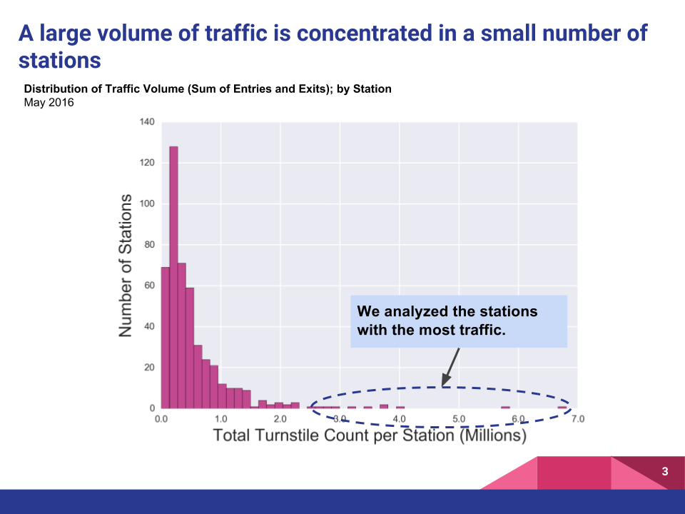
Traffic was highly concentrated in a handful of stations; a few outlying stations handled more than 10x the mean total traffic
-
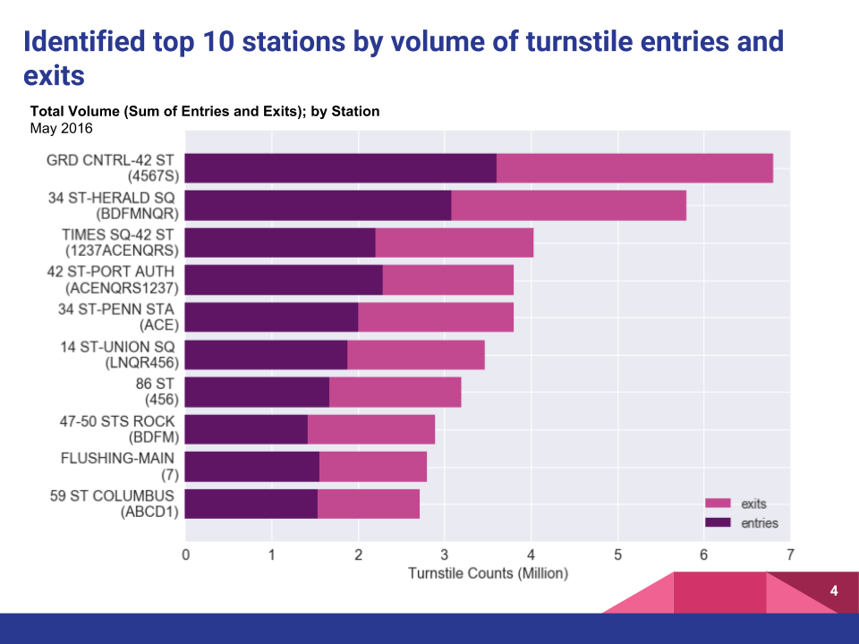
We identified the top 10 stations by volume of entries and exits; unsurprisingly, large commuter stations like Grand Central and 34th Street Herald Square topped the list. The top 10 stations accounted for approximately 15.5% of overall traffic for the month of May 2016.
-
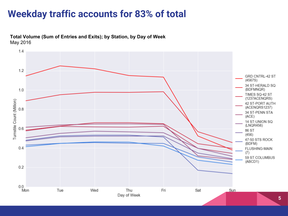
Looking at traffic by the day of the week, it became apparent that weekday traffic far surpassed weekend traffic - weekday daily averages were 1.9x higher than weekend averages and comprised 83% of total weekly volumes. In order to maximize exposure, we decided to exclusively focus on weekdays.
-
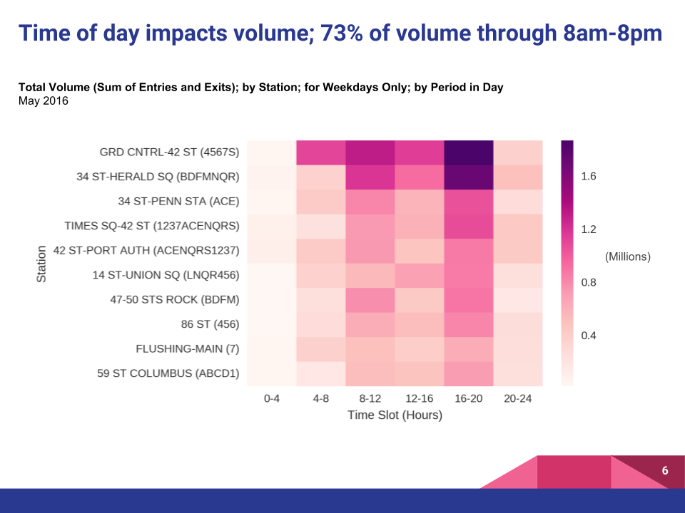
Splitting up the traffic into 4 hour time slots, we could see that volume was primarily driven by commuter rush hour traffic, and was particularly high during the 8am-1pm and 4pm-8pm time slots. This effect was especially pronounced for the top two stations.
Recommendations
To provide actionable insights, we would need to consider the limited resources that a non-profit may have. Our data led us to very specific recommendations on shift prioritization purely based on the volume we were seeing in the data. In order of magnitude, these were:
- 42nd Street - Grand Central Station from 4PM-8PM, Mon-Fri
- 34th Street - Herald Square from 4PM-8PM, Mon-Fri
- 42nd Street - Grand Central Station from 8AM-12PM, Mon-Fri
- 34th Street - Herald Square from 8AM-12PM, Mon-Fri
- 42nd Street - Grand Central Station from 12PM-4PM, Mon-Fri
- 34th Street - Herald Square from 12PM-4PM, Mon-Fri
- Remaining top 10 stations from 4PM-8PM, Mon-Fri
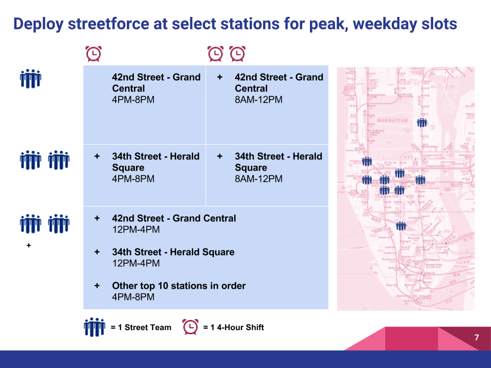
Unsurprisingly, large commuter hubs and the weekday rush hour drove the bulk of the traffic. Without any further data on conversion, we recommended targeting these stations/time slots based on volume alone.
Thoughts on Improvement
There were two notable areas in which we could have improved our analysis:
- Refining deployment locations - We had a theory that people who are static are more likely to pay attention to solicitors, so we thought about how we would use additional data to refine our placement around coffee shops, station platforms, and even smoking stops.
- Incorporating Conversion - While we didn’t have time to incorporate additional datasets to support hypotheses on conversion, we could have inserted relative assumptions. These could include hypotheses such as ‘people may be more likely to stop on the weekends’, or that ‘people who work at (and are proximate to) tech companies may be more sympathetic to the cause’. Additional data that we would have incorporated would involve concentrations of desirable sociodemographics, professions, residents (vs. tourists vs. transit commuters) and political donations.
Takeaways
- Insights from a single source of data are less meaningful than from joining multiple datasets - The real value in exploratory data analysis is being able to join multiple datasets to extract new patterns and insights. While our volume-based analysis was telling, the ability to cross-reference datasets for conversion would have given the analysis more impact.
- Data science = data storytelling - Even the most brilliant analysis can be useless if it is not structured and communicated well. Storyboarding our presentation up front helped us to streamline our investigation and give our analysis and visualizations focus.
Leave a Comment